A lot of planning goes into designing a kitchen and making it not just as practical and as functional as possible but also stylish and aesthetically pleasing. Finding the balance between all these elements can often be challenging.


There are many different ways to achieve this. We often enjoy looking at various different kitchen designs and seeing all the new and cool ideas that others have implemented into their designs. This helps to keep an open mind and to in turn come up with original ideas. Let’s be inspired together.
Kitchen decor with Earthy influences
When designing this kitchen and the rest of the spaces around it, Georgia Ezra of Studio Ezra aimed to create a very tactile experience. The materials and finishes were carefully chosen for their ability to establish a connection to the earth and to awaken real sensations. For example, the tiled floor is wonderful for walking barefoot on and the walls and in this case also the wooden furniture creates a very comfortable and welcoming environment.
Elegant marble surfaces
It’s no secret that marble is a wonderful and timeless material which can elevate any space. In the kitchen, marble countertops and backsplashes can add a very refined look to the decor around them. In this case interior designers Handelsmann + Khaw made sure to also give the kitchen a stylish tiled floor and to welcome the outdoors in through the large windows.
Small but very chic
A lack of space is not a reason to dismiss any particular style or features. This kitchen designed by White Arrow may not be very large but it has a very chic and beautiful decor. The light color palette helps it maintain an airy and open feel and the small kitchen island is both a practical addition and a nice visual detail which grounds the space and acts as a focal point together with the beautiful pendant lamp hanging above it.
Modern kitchen decor with retro accents
Eclectic designs are a wonderful way to express one’s unique style by combining elements with different characteristics or from different time periods. In this modern kitchen defined by a very clean and simple aesthetic, the island is what adds character to the whole space. It has a beautiful retro charm and a farmhouse vibe and it contrasts with the minimalistic cabinets but at the same time, it look very natural in here.
Skylights and concrete
This beautiful interior by Design daily is also a wonderful melange of influences and styles, with emphasis on modern and industrial. The kitchen in particular is quite interesting. It features a concrete floor and an island with seating completely covered in white tiles which coordinate with the backsplash. There’s also exposed brick and lots of wood which helps to create a very inviting and comfortable ambiance.
Old meets new
We love the idea of incorporating elements from a house’s original architecture into a new and fresh design and rediscovering its past and history in the process. Take a look at these beautiful exposed stone walls and archways that frame this gorgeous kitchen. They definitely stand out against the minimalistic white cabinetry, the immaculate floor and all the other stylish detail. This strong contrast is what makes this kitchen decor look amazing.
Black and white
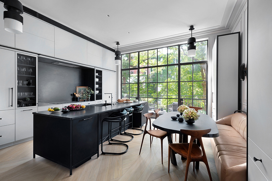
The combination of black and white is truly timeless and perhaps the most versatile of all in terms of color palettes. it looks magnificent in this contemporary kitchen by Crystal Sinclair Designs, especially in combination with the light wooden floor color and this exquisite waterfall island countertop. The occasional hint of grey and the subtle pattern introduced by the marble help to balance the decor in a very elegant way.
Dark blue accents
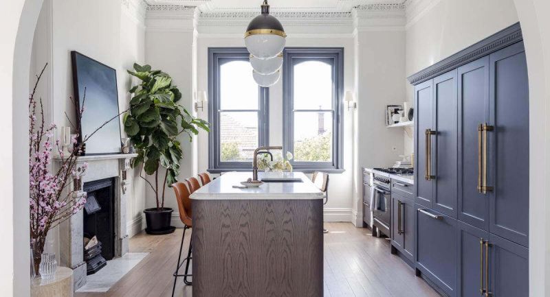
More often than not, kitchen decors are based on neutral color palettes. However, sometimes it’s worth being bold and choosing something different, like this beautiful selection of dark blue accents for the home interior designed by Doherty Design Studio. It adds a refined look to the room and the impact of the color is even stronger in combination with the white walls and ceilings. The exposed wooden beams also helps to bring out the charm in this unique design.
Eclectic bliss
This kitchen features a really nice blend of modern and traditional design elements. This helps to look and feel very inviting and adds personality to each piece of furniture. The attention to details such as the drawer pulls and doorknobs, the sink faucet or the pendant lamps hanging above the island are what make a huge different in this case. This beautiful interior is the work of studio Whittney Parkinson Design.
Spacious and welcoming kitchen layout
When the lack of space is not an issue, a kitchen can have huge potential. Not only can it be packed with lots of storage and features like a cool kitchen pantry but it can also become more than just a cooking environment. It can be a social space, an area where family and friends can gather around the island, tell stories and feel comfortable. That’s exactly we would describe this gorgeous kitchen designed by Elizabeth Roberts Architects.
Simplicity at its best
If there’s one thing we can say about this kitchen designed by Joanna Lavén it’s that it’s very simple. In fact, the kitchen area itself is designed to blend in with the white walls and to look super bright and airy. The small island made of elegant marble is the element that stands out the most, apart from this gorgeous chandelier of course. The herringbone floor and the dining setup seem to seamlessly ground the kitchen and complement it just right.
Warm and cozy kitchen interior design
If the goal is to make space feel inviting, warm and cozy, wood is one of the materials which can insure that. Its natural beauty adds uniqueness to the decor and there are many different ways to incorporate wood into a variety of different styles. This lovely home interior by Pac Studio is a nice example. You can this strategy being used here in combination with darker color tones, neutrals and retro design accents to create a very welcoming ambiance.
Soft neutrals
Although it’s true that neutral colors such as beige or ivory can look quite boring and monotonous in certain contexts, they can also make interiors look very refined and elegant. A perfect example is this beautiful kitchen designed by Kennedy Nolan which lacks bold colors but makes up for it through soft color tones, smooth lines and an interesting geometry. Subtle differences in nuance and texture add depth to the design and help this area stand out.
Kitchen decor with Shades of gray
A restrained color palette allows the focus to be on form, the materials and textures used in a design as well as the finishes used and the way in which everything interacts. This beautiful kitchen designed by Lucy Bock Design Studio is wonderful in its simplicity. The soft grays, the white backdrops and the subtle warmth of the wooden floor allow it to look spectacular and rich.
Small and charming
Although the space here is limited this definitely doesn’t look like a small kitchen. It’s such an open and airy space and the furniture, the colors and everything else are perfectly balanced and used to add depth and character to the space. The kitchen features white cabinets and open shelves as a backdrop and a beautiful wooden island which doubles as a space divider and as a bar. Beyond that, a small empty space separates it from the living room. This is a design by studio Pluck.
A multifunctional approach
Don’t you just love the fact that this looks like a kitchen but at the same time it doesn’t? It’s such a strange and unique design with lots of familiar elements in it but also quite unusual at the same time. This is part of a gorgeous Victorian home designed by Jillian Dinkel and as you can see it has quite a grand feel. The island is the centerpiece of the room, complemented by generous storage but also by an elegant fireplace.
Dramatic blacks for the kitchen cabinets
Not many dare to use black as a main color in the interior design of their home but when done right this can look extraordinary. This kitchen designed by ASHE LEANDRO is such a beautiful example. It looks so poetic, so luxurious and bold and yet it’s simple. The black furniture and backsplashes are complemented by a beautiful tiled floor with a rustic feel to it and by metallic gold accents which elevate its design even more.
Bright and airy whites
At the other end of the spectrum we have white which is such a pure and versatile color. It’s a magnificent choice for modern and contemporary interiors and versatile and timeless decors. In this kitchen designed by Megan Grehl it’s paired with stainless steel surfaces and appliances which give this space a very professional look. The kitchen layout however allows it to be very friendly and inviting.
A seamless transition
A lot of kitchens today are designed to be open and to be integrated into large and open social areas. They’re no longer just functional but instead, they’re welcoming and more versatile than they used to be. In this beautiful interior designed by Alisa Bloom the kitchen seamlessly transitions into a living and dining area. Three once separate rooms are combined into one and it’s such a pleasant and inviting setup.
Bold colors
There’s something fresh and inspiring about spaces like this one which make use of bold and vibrant colors. These nuances are so rich, both individually and when put together and it’s wonderful how harmonious the entire composition is. Also, the farmhouse style of the kitchen makes this space feel extra welcoming. Little details such as the patterned rug and the chandelier really help to bring it to life. This is a design by Crystal Blackshaw.
Brass accents
It’s quite easy to elevate a simple or minimalist design with eye-catching details and finishes, like this brass kitchen backsplash for instance. It stands out even more by contrasting with the matte black island and cabinetry and the transition is made smoother by the light grey walls and the white ceiling. It adds glamour to this space together with the rather unique chandelier. This is a design by Meyer Davis.
Parisian flair
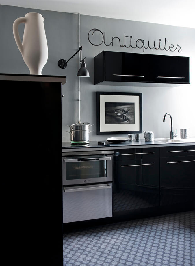
At first sight one might be tempted to say this is a rather plain and simple kitchen without much character. However, a closer look reveals all sorts of carefully selected details that make this design special and give it a type of charm often encountered in old Parisian homes. The delicate pattern on the floor, the way in which the cabinetry is elevated off the ground and the way in which the light hits the light gray wall just right are just a few of these details. This beautiful design was created by Émilie Bonaventure.
Perfect harmony
A harmonious kitchen decor means a perfect balance between looks and function and can further be described as a melange of elements that stand out but at the same time blend in seamlessly. This can sound a bit strange and poetic but it can be easily visualized through beautiful designs like the one created here by Terracotta Design Build Co. This is such a harmonious blend of colors, finishes and textures and although there’s plenty of details for the eye to focus on what really stands out is the space as a whole.
Subtle patterns
A design or a pattern doesn’t need to be very striking in order to be bold. Check out the subtle patterns introduced in this minimalist kitchen by studio Nicemakers. The chevron wood stripes on the cabinet fronts and the abstract wall design are not meant to be striking or immediately eye-catching but they’re definitely memorable and have a deep impact on the design and decor of this space.
Soft accent colors
Sometimes introducing an accent color can help to break the monotony of a decor, to add depth to the room and to guide the eye towards certain details and features, like this beautiful table at the center of a black and white kitchen. It certainly stands out and it makes a beautiful statement of style and elegance. It’s part of the contemporary design created by Studio PLOW.
Neutral with a twist
All materials have variations and this allows them to adapt to suit a variety of different styles and contexts. Wood, marble or stone can be both neutral and bold, both simple and complex. Finding the right variant and the right combination can make all the different when it comes to beautiful interior designs, like this lovely kitchen decor created by Athena Calderone from studio EyeSwoon.
Serene and inviting
By combining the kitchen and dining room together, studio Transition State make this space look and feel inviting, casual and more airy and open than two separate areas would have been. The black and white palette suits the space well and allows the textured floor to stand out and to really bring these areas together. Furthermore, the skylights adds a sunny and cheerful vibe to the room.
Fresh and bohemian
This is such a unique and gorgeous kitchen. The centerpiece is this stone island which looks like an exquisite sculpture, a statement piece with a minimalist geometry but graceful details on the surface. The backsplash is similar in style but a lot less eye-catching. The wooden floor and the ivory cabinets are the perfect addition to decor such as this. Together, these elements combined create a luxurious but also bohemian aesthetic. This is a design by Elizabeth Roberts.
Mid-century influences
A kitchen renovation shouldn’t always imply a total remodel, a drastic change in style. The best example we can give here in this charming kitchen decor created by Kevin Dumais. It’s infused with mid-century modern and country chic details and it maintains a clean look. It’s not very big but it has plenty of storage cleverly and seamlessly integrated in its design. A tiny island brings it all together.
Fresh and exuberant
This might not seem like a very exuberant space on its own given its monochromatic design and contemporary minimalism. Still, kitchen decor has to also be considered in relation to the other spaces around it. This stylish kitchen is part of a magnificent home designed by studio MKCA, filled with colorful and bold furniture pieces and decorations and with art deco influences. Its simplicity helps to balance out the interior as a whole.
The post Kitchen Decor Ideas With Unique Influences And Inspiring Features appeared first on Home Decorating Trends - Homedit.


0 Commentaires