Having your own backyard where you can lounge in the sun all day, entertain guests, swim in the pool or do some gardening is definitely amazing but doesn’t just happen overnight. A great backyard that you can be proud of takes planning and work and also requires some inspiration. We can help with the latter and we have some cool ideas to share with you today.
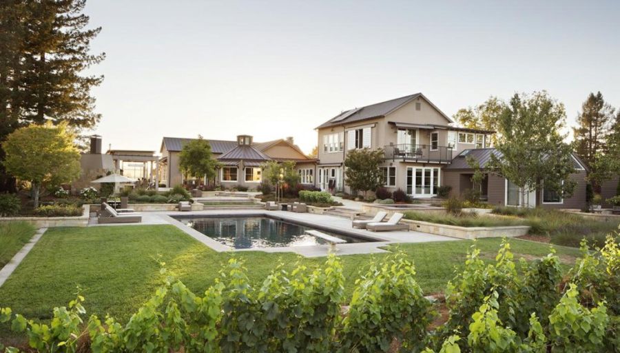
You can tell that this residence was designed for outdoor entertaining just by the sheer size of its backyard. It has a large swimming pool, a big deck with lounge chairs, an outdoor living/ dining area and also a pretty big lawn. It’s something that studio O+ L BUILDING PROJECTS designed a while ago in Los Angeles.
This house in The Hamptons has a pretty big and amazing backyard as well. Its owners asked studio ICRAVE to transform the outdoor portion of their site into a contemporary and relaxing retreat where they can relax and unwind. They wanted a swimming pool and a design reminiscent of contemporary spa resorts. The studio answered to these requests by creating this amazing pool house.
Located in Phoenix, Arizona, this contemporary family home features a rather simple backyard. However, that doesn’t mean it’s not amazing. In fact, we’d say it’s perfect for this climate and location. The owners worked with studio Knob Modern Design to bring the property to life and part of the project was to transform the backyard. The new and improved design features a lovely patio, a bar area and a modern wood pergola.
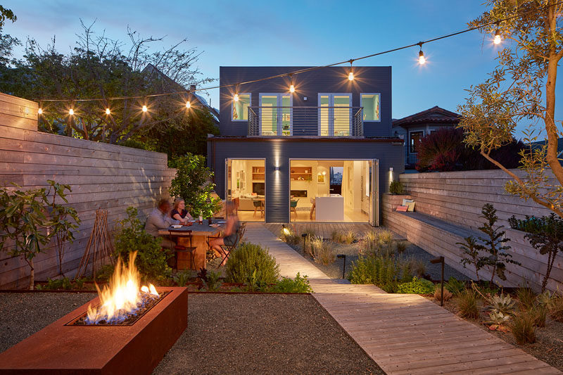
This is the Remember House, a contemporary family home located in San Francisco. It was designed by studio Edmonds + Lee Architects and it’s clad in opaque dark panels which contrast with the surroundings and allow the building to gain individuality. Although the site on which it stands is small and has a slope, the house has its own little backyard. A staircase lined with planters descents into the small garden where there’s an asymmetrical deck with a cozy sitting area.
When the owners of this house in San Francisco approached YAMAMAR Design Architects for a remodel, they asked for an urban oasis. They wanted their home to be modern, fresh and minimal but to also feel warm and welcoming. The team managed to offer them all that as well as a wonderful backyard that is practically an outdoor version of a cozy living room.
This backyard has something that none of the other projects so far do: a sunken fire pit. The reason for designing the fire pit this way was that the architects wanted to create an unobstructed view of the backyard for this beautiful home which they built in Malibu. The sunken pit can accommodate a large group of people, being lined with concrete benches on all sides. This is a project completed by studio Burdge & Associates Architects.
Speaking of sunken fire pits, this backyard has one too. It was designed and built by Jake Moss, a landscape designer who completely redefined the relationship that this house has with the outdoors. The sunken fire pit sits at the center of the backyard and is embedded into a raised wooden deck which also acts as a pathway across the garden.
This backyard also has something special: a little reading retreat. That’s right, there’s a little shed out here where the owners and their guests can go to relax with a good book. The shed was designed and built by studio Board & Vellum and it sits in the backyard of a lovely home. Out here there’s also a fire pit, a hot tub and an outdoor sitting area. As for the shed itself, glass walls and a skylight ensure that it gets plenty of natural light.
A pool pavilion takes over most of this backyard. It brings together a lot of cool features, including an octagonal fire pit with a curved sitting area, a bar and dining area, a bbq space and an outdoor kitchen. The indoor-outdoor transition is seamless. Another cool little detail is the hood which pulls the smoke up and outside the pavilion, keeping the air clean and the atmosphere pleasant and inviting at all times. This was a project completed by studio CG&S.
Small backyards can look amazing too. The perfect example is this wonderful project completed by studio Promised Path Landscaping. This small backyard has a nice indoor-outdoor kind of vibe. There’s a bbq island with a grill, a kitchen island with a sink, a concrete counter that can serve as a bar, a fireplace and comfortable seating. It’s the perfect place to enjoy the afternoons with family and friends. Also, the greenery adds a fresh and vibrant touch to the decor and increases privacy without making the backyard feeling any less airy and open.
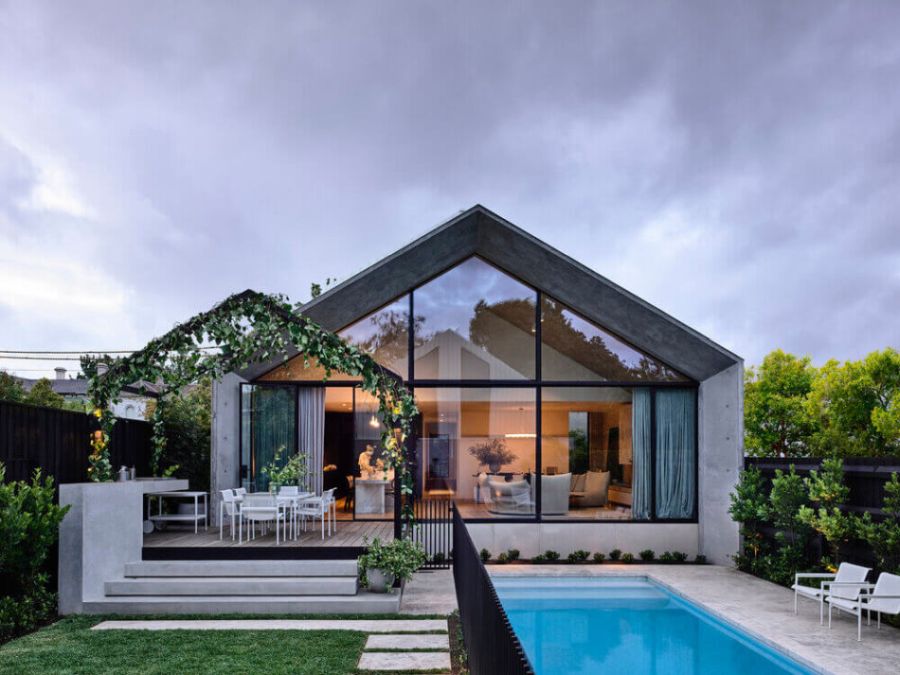
A while ago architecture studio Kennon worked on creating an addition to a house in Melbourne. They built it out of concrete and used the backyard as the link between it and the main house. The new addition opens onto this beautiful raised deck framed by vines and hanging plants and is also bordered by the swimming pool.
It may not seem like much but even a small backyard area can totally change the look and feel of a house. For instance, this house from Sydney which was redesigned by Tom Mark Henry has this small outdoor patio area with just a small table and a couple of chairs. The fact that it’s so simple is what makes it so relatable and inviting in the first place.
When designing this little holiday home in France, L’Atelier Delphine Carrère went with a casual and relaxed aesthetic and a simple but chic look. In the backyard, they created this lovely picnic area with a long wooden table and a couple of benches on each side. There’s also a sunshade casually stretched between the trees which gives this area a very laid-back feel.
Big open spaces are often part of the ideal image we set for our backyards. It’s nice to emphasize the contrast between the limited indoor areas and the airy and sunny backyard. Nevertheless, including elements such as a cozy seating area around a fire pit helps to make this space not just visually impressive but also comfortable to be in. A really nice balance was achieved here by studio Wade Design Architects.
Inner-city houses can often struggle to truly be in touch with nature and their surroundings and one of the main reasons for that is a lack of a proper backyard design. Even a small backyard can be designed to look very fresh and welcoming and this can help a lot to disconnect the inhabitants from their busy lives and to make them feel like they’re in the middle of a beautiful oasis. One of the best designs in this regard was created by studio Adam Robinson Design which you can see here.
It’s not just the size or layout of a backyard that matters but also the little things like the furniture and the decorations that you choose to put out here. We absolutely love the casual roof over this outdoor living area and the fact that there’s antlers on the wall, layered rugs on the floor and comfortable furniture. There’s also a little open area out in the garden with a lovely umbrella as a centerpiece. This is the work of Gregory Mellor.
Something else to keep in mind when designing a backyard is that there should be a smooth transition between the indoor spaces and the outdoor ones. This is especially true for modern and contemporary homes. Sliding glass doors and breezy curtains can certainly help with that, a strategy that was beautifully used here by studio Tom Roberston Architects.
To avoid making the backyard look too flat or monotonous a strategy can be to work with layers and different floor levels. This would also be great for differentiating different sections of the backyard and making each one stand out and look more interesting. Using the same palette of materials for all however would be nice. Check out this beautiful design by CLO Studios for more inspiration.
Trees can add a lot of character to the backyard so it’s worth preserving them if at all possible. They can be turned into natural focal points, integrated into the deck and used in all sorts of other ways. Here for instance the tree looks really beautiful at night when the lights put an emphasis on its sculptural branches. This backyard complements a beach villa designed by Gavin Maddock.
Adding diversity to the backyard is sometimes easier said than done so it’s very inspiring to check out cool and unusual designs like this one by studio COS Design. It’s interesting how all the different areas are spread out and placed on different levels. This gives each feature plenty of character. The pool area in this case is the main focal point.
Minimalism can be tricky. A minimalist backyard can sometimes lack character and style if there’s no depth in its design. Even the illusion of depth is enough to make the difference between a flat and boring design and an engaging one.
Here for instance studio General Assembly used the gentle slope in their favor. This minimalist backyard starts flush with the floor level then transitions onto a lower poolside deck. Also the pool is flush with the ground on one side but ends up standing out on the other.
The post 21 Gorgeous Backyards That We Can All Learn Something From appeared first on Home Decorating Trends - Homedit.


0 Commentaires