The colors of a space probably have the largest initial impact on how you feel in that space. Are the colors soft and dreamy? Are they bold and vibrant? Are they muted and serene?
The bedroom is a wonderful place to introduce a color scheme that fits the mood you want to feel most while you’re there. This is different for everyone, but the concepts behind selecting the bedroom color palette are pretty standard.
How to pick a color scheme that suits your bedroom
With so many different colors in the spectrum to choose from, picking a color scheme is not easy. The fact that there are lots of different nuances as well makes this even more challenging. So how do designers do it? Well, it’s a combination between following certain rules and adapting to each particular space and the mood that they’re trying to achieve. Here’s a few tips that will come in handy next time you’ll be faced with the challenge of choosing a color scheme for your own bedroom.
The difference between warm and cool colors
Before we go into all the different rules and details, it’s important to make the distinction between warm and cool colors. This differentiation will directly impact the type of ambiance that the colors will create in the room. The warm colors include shades like red, orange, yellow, brown, beige and various similar tones. The cool nuances are blue, green purple, gray and any variations and combinations of these colors. For a bedroom it’s usually the cool nuances that work best because they help create a relaxing and calming environment.
Complementary colors
In order to visualize complementary colors it’s best to refer to the color wheel. Two complementary colors are those that sit directly opposite to each other on the color wheel, like blue and orange, red and green or yellow and purple for example. They’re very different from one another but they complement each other and they bring out the energy in one another through high contrast. Of course, decorating a bedroom only using complementary colors wouldn’t really look great so consider using these as accent colors and combining them with neutrals and other soft tones.

Analogues colors
We’ve established that complementary colors come in pairs of two. Analogs colors come in sets of three. To understand what that means just pick a color on the color wheel and then also pick the two colors on either side of it. For example red, orange and yellow are analogues and similarly blue, purple and red make up another trio. When using analogues colors in interior design pay attention to the proportions.
The 60-30-10 rule
As mentioned before, the proportions in which you use each nuance in your color scheme is important. For example, if you go with a set of 3 analogues colors, one should be the dominant color and the other two can be used in smaller proportions. There’s a rule that you can keep in mind whenever you’re juggling multiple colors. The 60-30-10 rule will help you keep your design balanced. It’s quite simple actually. You pick a main color for the room and that will take up approximately 60% of the space. Typically this would be a neutral shade. Then you pick a secondary color which will take up 30% of the room. This can be a bit bolder than your main color. Finally, you use the boldest and most vivid nuance as an accent color and that one is reserved for 10% of the room.
The connection between color and mood
As you may have noticed already from your own experiences, colors impact the mood. In other words, you can manipulate the type of mood and ambiance that a room offers through color. Some nuances are known to make spaces feel calming and relaxing while others fill a room with energy. Here’s a few examples to keep in mind for future projects:
- Neutral colors bring balance: nuances such as white, beige, ivory and so on don’t really have much impact on mood which makes them great for spaces that you want to look and feel balanced. Use a neutral color scheme for a guest bedroom if you want it to be versatile and to make others feel welcomed regardless of their own personal preferences.
- Blue is relaxing: this is a great color for bedrooms because it makes the room feel soothing and relaxing. You can rely on pastel blues if you want the space to seem open and bright and you also have plenty of variations to choose from if you want something a bit more powerful. Turquoise is a particular beautiful shade.
- Reds are stimulating: it’s quite difficult to incorporate red into a room’s color scheme and that’s because it’s a very powerful color. It’s not the type of color that you’d want to use in a bedroom but it can fit a living room quite well. Reds fill the room with energy and they’re very stimulating.
- Yellow and orange are cheerful: this is a very positive and uplifting color scheme and a really fun one to work with as well. It can suit a variety of different spaces including bedrooms. If you enjoy waking up full of energy and optimism, add a bit of yellow or orange into your bedroom’s décor. These are very happy and cheerful colors but try not to overuse them.
- Greens are fresh and soothing: this is an interesting color scheme because on one hand green can be a very refreshing color but on the other hand it also has a soothing and calming effect. It’s the color that we associate with nature, freedom and prosperity and it’s also considered restorative. From that perspective, it’s a wonderful color for a bedroom.
- Purples are soothing and sophisticated: Similarly to how greens are perceived, light shades of purple such as lilac or lavender also have a soothing and revitalizing effect. They’re excellent accent colors for bedrooms and bathrooms. Darker shades of purple can make a space look sophisticated but are very powerful so it’s best to use them in small amounts.
- Black is extravagant: This is not really a color that comes to mind when it comes to interior design which is a shame because it has lots of potential. Black and dark grays are definitely very powerful nuances and they can make a space look really sophisticated and extravagant. They should however be balanced out with lighter colors. Black and white is an iconic color scheme for a reason.

Tips for using dark colors in your design:
As mentioned before, dark colors are very powerful which can make them feel quite intimidating. It can be challenging to successfully integrate them into a room’s interior design so here’s a few tips and tricks that can help you:
Make a big space feel cozy – spaces that are very big and open can often feel impersonal and not as inviting or as cozy as small rooms do. You can control that by using dark colors to make the room look smaller and more intimate. You can use dark colors such as gray, black, dark blue or purple on accent walls or you can try a combination between a dark and a light color and divide the wall horizontally, painting each section in one of these contrasting colors.
Make furniture and decorations pop – by painting a wall in a dark color you can help contrasting furniture pieces and decorations stand out more and pop. For example, a white cabinet would blend in if the wall was also white or beige but against a black or a dark gray wall it stands out.
Create accent walls – it can be intimidating to paint all four walls of a room in a dark color plus this doesn’t always look great. Choosing a single accent wall and painting it dark, on the other hand, is easier to assimilate and can also add a lot of character to the room.
Find inspiration in nature – when it comes to dark colors we don’t really think of them as occurring in nature which can give them a superficial and artificial look. However, there’s lots of inspiration that can be found in nature. Just think of all the dark and beautiful green nuances found in forests, the beautiful night sky, the dark brown tree trunks or all the different types of stone that look mesmerizing and beautiful. You can bring all of these nuances inside your home and create a dark color scheme that’s pleasing to the eye and that feels natural.
Bedroom color scheme inspiration ideas

If you’re interested in learning more about color schemes for bedrooms, and how to go about creating the space you want, read on. Hopefully you’ll find inspiration and information to help you select your perfect bedroom color palette.
Related: The 10 Best Memory Foam Mattress Toppers Let You Wake Up Refreshed and Pain-Free
Red, white, and black bedroom.

Black and white is a classic color scheme, of course, but adding red into the mix just takes the colors to a whole new level of energy. Red is known as the most energetic of all the colors, so it makes a nice pairing with the solid black and white palette. Great color scheme for a modern bedroom that buzzes with inspiring energy.
Neutral grey with a pop of color.

Soft greys on the walls, ceiling, and larger accessories make for a serene yet contemporary bedroom setting. But vibrant red accents breathe life and personality into the otherwise neutral space.
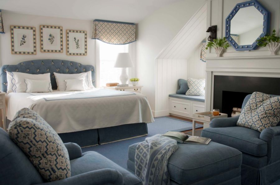
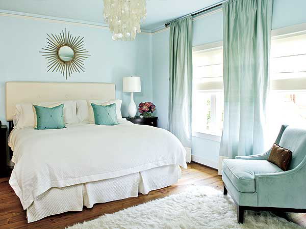
Cool blue and white.
Blue and white as a color combination in general is an eternally fresh, scrubbed-clean combo. As the color scheme for a bedroom, blue and white has the same effect. The bedroom of these colors looks friendly, “down-home,” and inviting. Be sure to incorporate some earth tones (e.g., wood furniture pieces) to ground the airy space.
Vintage pink and grey.
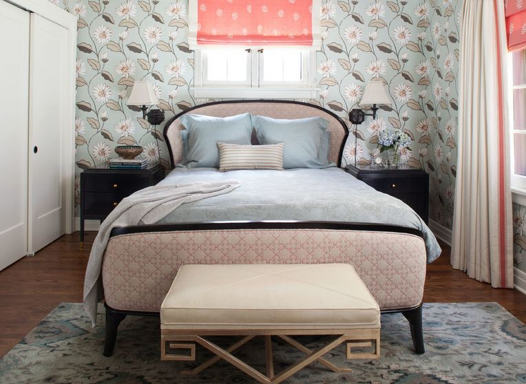
Pink and grey is a classic color combination that can be used in the most adorable of infant nurseries or the chicest of master bedrooms. It all depends on the colors’ undertones, sheen, and dosage. For a charming vintage feel in the bedroom color scheme, keep the pinks pale, almost as though they have faded over time.
Pink and orange bedroom.
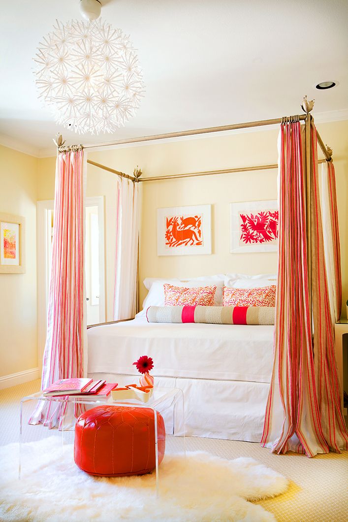
For a bedroom seeking a cheerfully retro vibe, pink and orange is a great color palette to explore. The colors themselves are bold, but the room itself needn’t be floor-to-ceiling tangerine and Barbie. Incorporate the fresh colors into artwork and pops throughout your otherwise airy, neutral bedroom for a fun and rejuvenating bedroom color scheme.
Fresh green and a pop of pink.

Pink is often associated with babies or young girls, but the truth is, it makes a wonderful accent color in a green bedroom. As a relative of red, pink can play the role of complementary colors with green…more successfully, usually, because the bedroom won’t look like Christmas year-round.
Two-toned neutrals.

Grey with taupe, cream with charcoal, or tan with ivory all make lovely and calming bedroom color schemes. Pairing two different neutrals together to create a color scheme provides variety in the coloring (thus, more visually interesting) without taking away from the soothing neutrality.
Forest green with earthy brown.
A color combination found all over the place in nature is one we can certainly take seriously, and forest green with earthy browns is no exception. Although the depth and darkness of these colors could be a little overwhelming, the key to making this bedroom feel alive and inviting is to ensure plenty of natural light. A perfect – and natural – balance to nature-based color palette.
Green and purple.

It’s easy to get caught up on a color scheme for the bedroom (or any space, for that matter) and have that palette dictate every décor decision for the space. But the truth is, a bedroom color scheme can provide the general inspiration for the overall vibe of the space – the details and décor needn’t be specifically within that palette to be effective. Like this green and purple bedroom vignette. There’s not a matchy-matchy exclusive green and purple configuration, but the vibe is there.{found on amandanisbetdesign}.
Spring green and sky blue.

The color names say it all, don’t they? These analogous colors (next to each other on the color wheel) have gone together since the dawn of time, and they are a perfect color scheme for bedrooms today.
Modern orange and blue.

It’s definitely useful to look outside the primary colors when considering color schemes for the bedroom. This soft sky blue, for example, looks marvelous with a deep burnt orange. Plenty of pattern and details make the bedroom look and feel homey as well.
Coastal-inspired blues with creamy white.
Scientifically, blues and greens are visually soothing. If this is the vibe of your ideal bedroom, we’d recommend getting your inspiration from the seaside. Creamy whites, reminiscent of the clouds or whitecaps, pale aquas like the water itself, grounded by some earth tones (the wood floor here, like the sands of the sea) work together to create a truly serene space.
Sophisticated yet youthful blue and purple bedroom.

Feminine lavender takes on a life of its own when it’s paired with un-feminine colors. The reason blue and purple work so well together is because they are located directly next to each other on the color wheel. They are called analogous colors. Analogous colors tend to make lovely color schemes.{found on joystreetdesign}.
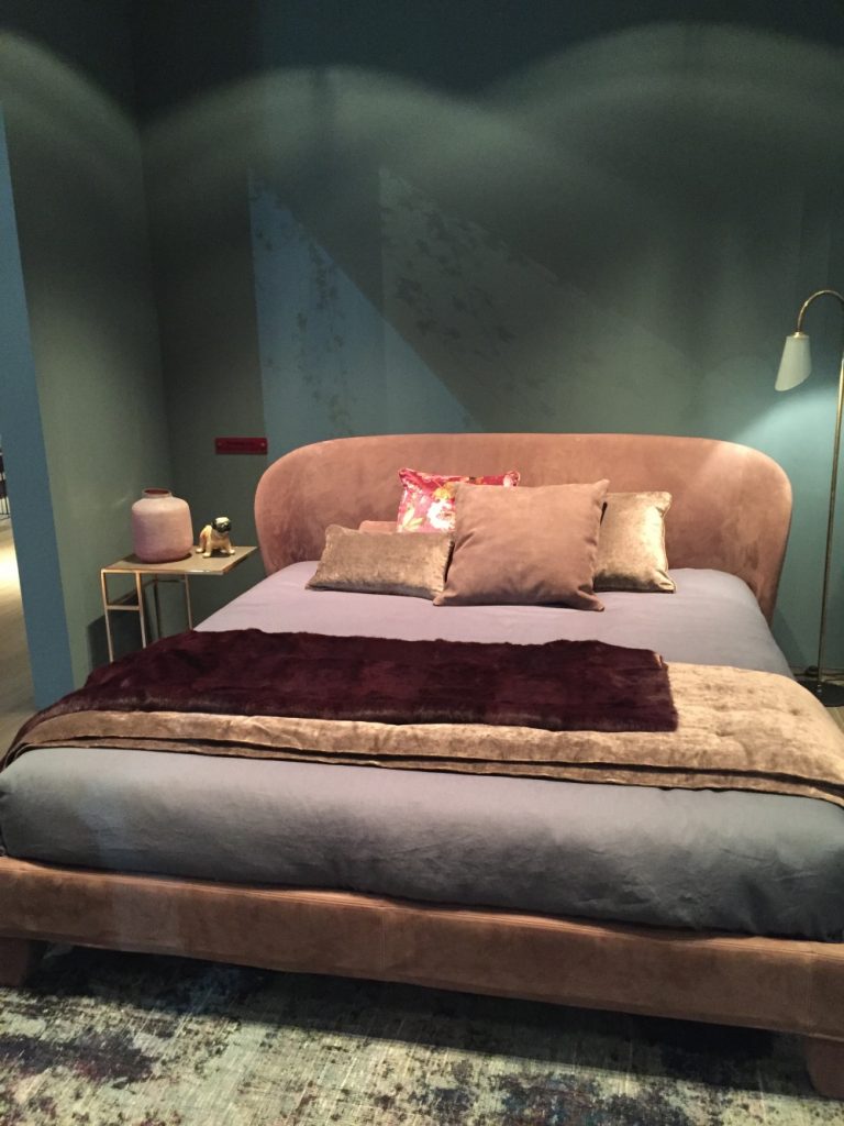
Deep teal and cognac (or caramel).

Cognac is a sophisticated, rich leathery tone that benefits from the presence of another color. But, for best results, the pairing color should have deep, rich tones as well. That is why deep teal and cognac go so well together as a bedroom color scheme. The colors are soothing yet serious, sophisticated yet warm. And adding a bit of brass shine into the mix just takes things over the top, don’t you think?
Grey and yellow bedroom.

This modern color palette has gained popularity in recent years for a variety of reasons. The “colorlessness” feeling that grey evokes is a perfect background for cheery yellow. The bedroom color scheme is sophisticated, fresh, and contemporary – all good reasons for leaning this way in a bedroom’s décor.
Cozy, grounded brown and navy.
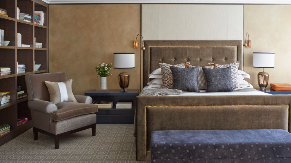
While greys have become the mainstay for neutrality in contemporary colors, this doesn’t mean that browns are out. Rich, deep browns add presence and maturity to this stately bedroom. The somber color is softened by details such as luxurious velvet on the headboard and footboard. Navy is a perfect complementing color – bold enough to be noticed, but in a sophisticated way.{found on helengreendesign}.
Classic red and navy.

It’s very easy to take a knee-jerk nautical color scheme like red and navy and turn a space into a nautically themed room. But even those without nautical décor tendencies can use the classic red and navy a color combination. Use slight variations of red (coral, for example), and make the deep navy a secondary player (or vice versa) for a fun twist on the classic bedroom color scheme.
Layers of white-like relatives.

Whether you veer toward the cooler grey side of white or the warmer ivories, a bedroom that is founded upon whitishness tends to fell soft, light, and bright. To complete your bedroom color scheme, add a few grounding elements, such as a navy throw or antiqued metallic.{found on helengreendesign}.
Luxe silver and blue bedroom.

There’s something about shimmery silver décor that, in many instances, feels luxurious. Adopting this silvery sheen as a primary part of your color palette for the bedroom (as well as its more matte blue counterpart) is a pathway toward a light, bright, and luxe bedroom without feeling overwhelming. Attention to textural details, and the incorporation of mirrored surfaces, keep this space feeling sophisticated and even warm, despite its uber-cool palette.
Black and white bedroom.
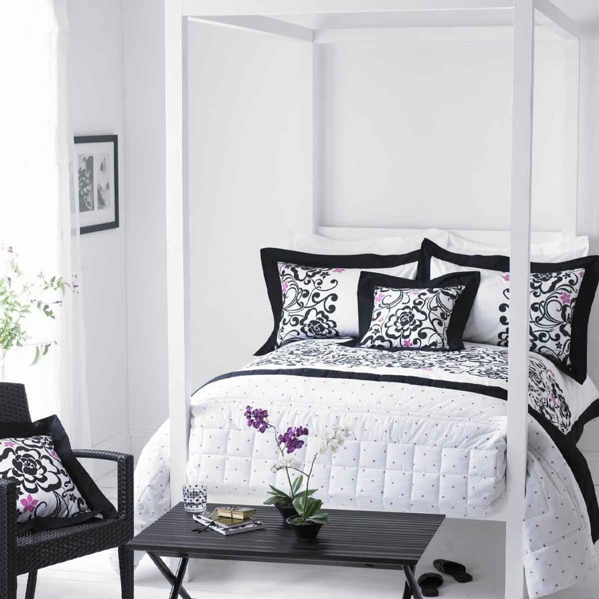
You can hardly ever go wrong with black and white as a color scheme, even (especially?) in the bedroom. The yin and yang of these polar opposites, the stark contrast they exude, makes for an eye-catching and dramatic bedroom space.
Neutral tan with dark accents.

Neutrals such as tan and beige are really great as primary colors but to avoid making the bedroom seem too simple and boring you can introduce a powerful accent color. In this case the dark gray surfaces help to anchor the space and give it an elegant aesthetic.
Dark orange and hints of light brown.

Orange is a bright and cheerful color at the core but there’s plenty of variations that can give you a slightly different effect. This dark nuance for instance is pretty close to red which gives this powerful and intense look. It’s paired here with a series of neutrals like black, white, gray and beige and there’s also some light brown accents which add a warm and soothing vibe to the décor.
Soothing shades of gray.

It’s not always just the colors that matter but also the way in which you use them. For example, in theory a bedroom decorated only with shades of gray sounds pretty boring but it doesn’t have to be that way. This one has tons of character and that’s because of the proportions in which these nuances are used, the patterns and the textures.
Neutral grays with warm details.
Continuing on the same note, here’s another beautiful and stylish gray bedroom which manages to look both soothing and relaxing but also quite dynamic. The warm accent tones and the patterns which they introduce into the décor combined with the strategically placed accent lighting make this a very inspiring bedroom design.
Soft pink and light neutrals.

One of the reasons why this bedroom design looks so well-balanced is because the colors involved. On one hand we have some dark grays which give the space a fairly masculine and rugged look but on the other hand we have the light beige, soft pink and tan accents which are soothing, delicate and go really well together.
Earthy browns on a dark backdrop.

Here’s an example of a bedroom design which transitions from very dark to light color tones. The black accent wall is used to give the room a cozy and intimate feel but it also help to highlight headboard which features these warm shades of brown. The décor then transitions into light neutrals.
Sophisticated purple as a focal point.

We mentioned before that purple is a great accent color because it makes spaces look sophisticated and luxurious. Here it is being used in a bedroom in combination with some grays and light wood accents and it looks magnificent.
Cool and warm colors.
As you know, on the color wheel we can distinguish between warm and cool colors. Green is an example of a cool nuance and it’s a very good color for a bedroom because it’s soothing and relaxing. Warm colors such as various shades of red and orange as well as brown are known to make spaces feel welcoming and cozy. Put these together and you get this gorgeous bedroom design.
Soothing and elegant neutrals.

Neutral-themed bedroom designs are quite popular because they just feel well-balanced. If the prospect of using a bold accent color seems a bit too daring or doesn’t really fit your style, consider something like this instead. This is indeed a very elegant bedroom and it actually has some muted accent tones that give it plenty of character.
A vibrant turquoise bedroom with green and white details.

Turquoise is such a beautiful and magnificent color, one that we often associate with exotic destinations. This is a wonderful use of a dark turquoise nuance on a bedroom’s accent wall. It contrast with the white surfaces giving the room a very clean and fresh look and it pairs well with the green accents as well.
Mystical mint green accents.
Light colors and pastels can be quite soothing and calming but they can also be eye-catching. In this beautiful princess bedroom it’s the mint green accents that stand out the most. You can use it as a source of inspiration if you want to play around with blue and green nuances to create a stylish décor.
Layers, patterns and muted accent colors.

You can also make a bedroom look and feel welcoming and cozy by using a selection of similar color tones and creating layers. Texture and pattern play an important role in interior design and here you can see how big of a different they make when using a muted color scheme based on neutrals and subtle colors.
Bright and fresh with a dark accent wall.

In case you’re worried that a dark accent wall color would make your bedroom look gloomy, here’s a beautiful example which demonstrates the opposite. Here the accent wall helps the lighter-colored elements pop and stand out more and it gives the eye something to focus on at the back of the room, then revealing all the stylish elements in between. This is an interior created by studio Blue Copper Design.
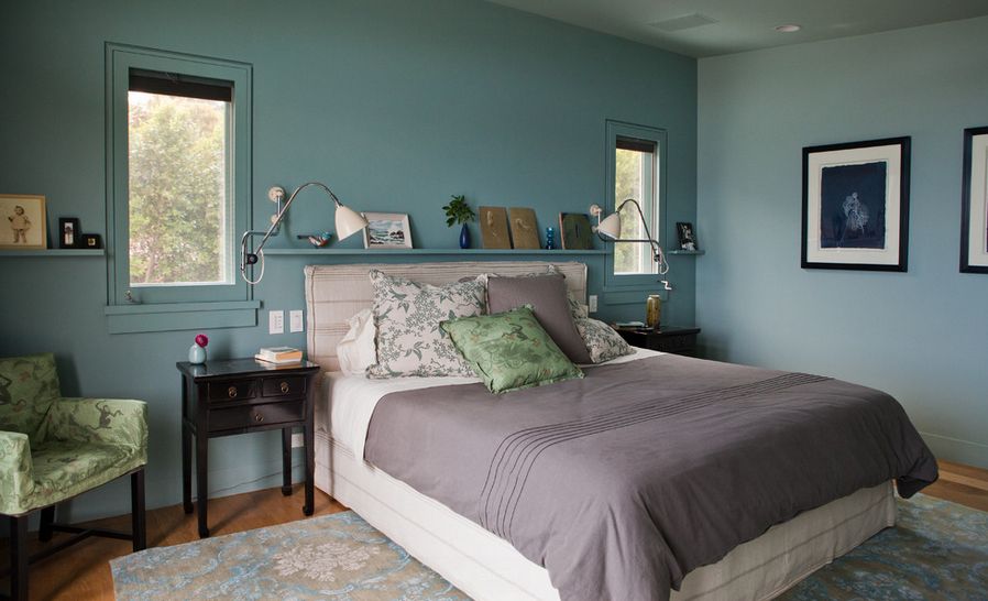
Soothing blues.

It’s so easy to see how calming and relaxing blue nuances can be when looking a design like this one. This bedroom by Ken Games Interiors is like a blank canvas filled with all these beautiful blue-toned details and it looks like such an inviting and soothing place to be.
Classic with a modern twist.
![]()
This is a really nice variations of the iconic black and white combo. Instead of black a dark gray nuance was used which softens the contrast and has a less harsh and intimidating look. It was used to highlight some of the design and architectural details such as the ceiling and it transitions into a lighter gray floor. Check out Rosewood Custom Builders for more details and ideas.
A color scheme inspired by nature.

You can always find the inspiration you need for a design in nature. When it comes to color schemes for a bedroom, this is a lovely example. Studio LeTricia Wilbanks Design used here a light shade of blue for the accent wall, dark browns for the furniture and green and blue nuances for the accessories and decorations. They’re balanced out by a series of neutrals.
Muted blues.
If the idea of trying to use some darker colors in your bedroom’s design sounds interesting and appealing but you’re not a big fan of bold and vibrant colors, try something a bit more muted instead. Check out this beautiful bedroom by studio Pinemar if you need a bit of inspiration or a push in the right direction.
Wood and natural browns.

Brown is a very versatile color and it looks perfectly at home in a décor that uses natural wood. These two elements put together can give a space a very warm and welcoming aesthetic. Here we have a modern bedroom with subtle rustic hints and the color palette chosen by studio Ezra Lee Design+Build is absolutely perfect for it.
Colors inspired by the forest.

It’s always interesting to see how certain themes and elements found in nature can be translated in interior design. A color palette inspired by the forest for example can include natural wood, perhaps a few dark brown accents and of course a bit of green and maybe a few blue details as well. Check out Gaetano Hardwood Floors, Inc. for more details and ideas
The post 40 Fantastic Bedroom Color Schemes appeared first on Home Decorating Trends - Homedit.


0 Commentaires