Analogous color schemes are much easier to understand than they sound. Grouping three colors together – that sit beside each other – on the color wheel is all the word analogous means.

It doesn’t matter which end you’re taking from, just as long as they’re neighbors. Whether it’s red, red-orange, and orange or violet, red-violet, and red, grouping these like-minded tones together will create an interesting, harmonious, and slightly monochromatic look for any room of the house.
When deciding on a scheme of this genre, the directions are simple. First, choose your main mother color and then choose two or three, even, colors on either side of it! Let’s have a peek at some real-life rooms that made this happen and you can get a feel for what they look like and how to use them inside your own home!
The Best Ways to Use Analogous Color Schemes in Your Home
1. Red, Red-Orange & Red-Violet

Combining these warm, rich hues creates a relaxing and inviting bedroom vibe with so much ease and simplicity that it’s hard not to want to jump right into bed for an afternoon nap. It’s also got quite the passionate and fiery appeal, don’t you think?
2. Yellow, Yellow-Orange & Orange

For a bright and a bit retro look, you’ll want to take a good look at this trio of vibrant and revitalizing colors. We are smitten over this youthful and spirited bonus area.
3. Blue-Green, Green, Yellow-Green
Smooth and refreshing, this trio of colors sits well on the color wheel and appeases the eyes of all potential visitors. There’s a lightness and brightness about these shades that make it a happy space without being too harsh on the eyes.
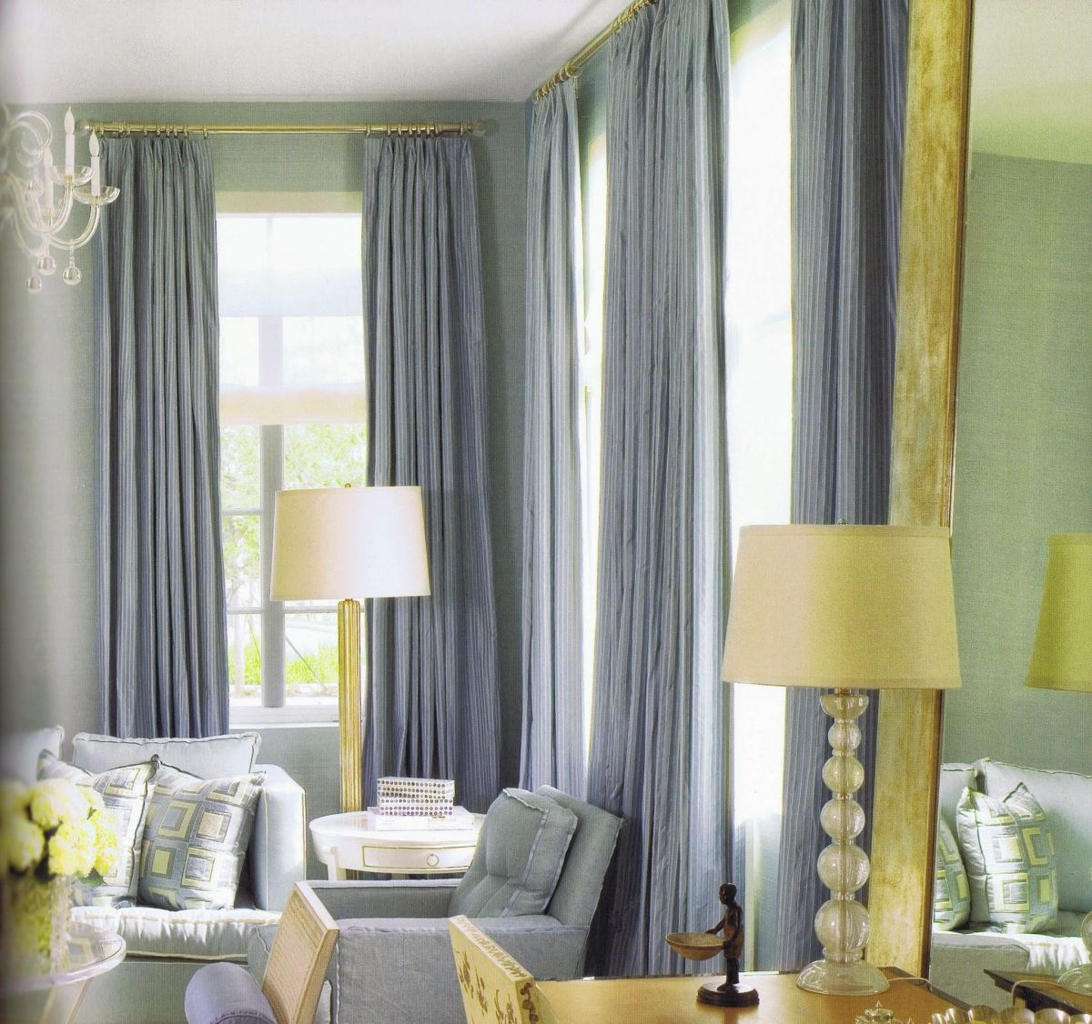
4. Blue, Blue-Violet, Violet
Cool and subdued, this living room is super trendy, ultra chic, and even a bit feminine in spirits. And everything works so well together because of their positioning on the color wheel and the complimentary undertones.
5. Red, Red-Orange, Orange
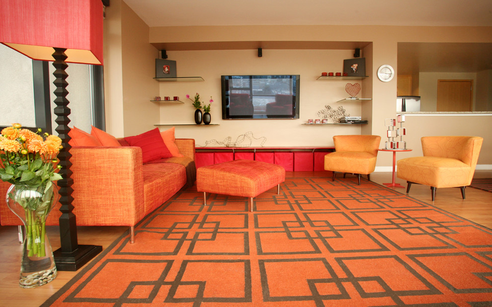
Slick, contemporary, and a bit retro in some of the furniture shaping, the colors of this room complement and add enough brightness and personality to make the entire house shine with delight. {found on susandianaharris}.
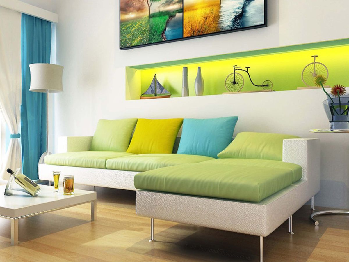
6. Green, Yellow-Green, Yellow

This is one of the most perfect examples of a smooth, analogous trio. Using the different shades of yellows and green just right, this living room looks like it’s ready for springtime! {found on jeffandrews}.
7. Blue, Green-Blue, Green

Here’s another great mix of neighboring colors. This mix of blues and greens adds an organic, natural beauty to an already spirited and friendly space in the house.
8. Yellow Green, Yellow, Light Orange
One of the reasons for using the color wheel to pick an analogous color scheme is because it can show you colors that you wouldn’t normally think go together! Just look at this living room which combines a lighter green with a soft yellow wall and pops of light orange color. You wouldn’t think these colors could look this refined together, but they do!
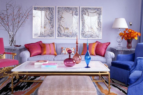
9. Pastel Shades of Pinks and Purples Analogous Colors
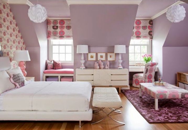
Remember though, the colors don’t have to be simply stated as “red” or “purple” – you can draw in shades and use pinks or even pastels in this way too. Pinks, lavenders, and even mints can be used as long as your staying within partnering colors on the wheel. Just take a look at this handful of beautiful, analogous-inspired rooms!
10. Pastel Yellow Green, Green, Blue-Green
Although this mix has popped up on the list before, it looks totally different in muted pastels instead of bright colors. This room looks much calmer with the lime green swapped out for a shade that is pastel. Additionally, the pastel blue green chairs give the room a soft, almost comforting look that can’t be achieved when using solid colors.
11. Don’t Be Afraid to Use Metals

If you pick brighter colors from the wheel for your room like Purple, Purple-Red, and Red, this can leave you wondering how you can incorporate all these amazing colors without overdoing it! Because these colors are so bright and vibrant, it’s probably best to go with more minimalistic furniture like pieces that are made of metal with white or black accents.
12. You Don’t Have To Use All Colors In Equal Amounts
This next homeowner chose to go with a purple-blue, blue, and blue green analogous color scheme but go easy on the pops of blue. This makes the purple blue chairs stand out much more against the blue green armchair. They also decided to keep the rest of the room neutral so as not to make the room too dark, as can sometimes happen with this particular color combination.
13. Mix In Some Wooden Neutrals

When it comes to using the color wheel to create an analogous color scheme in your home, it can be difficult to find furniture that fits. This is especially true if you pick to go with a scheme like blue, blue-violet, and purple, mainly because they just don’t make much purple furniture! When this is the case, don’t be afraid to grab a brown or tan coffee table—it will fit in just fine. See for yourself in this example on Darling Doodles Design.
14. Use Analogous Colors to Create a Mood

Most of the previous ideas mention how to not let your analogous color scheme take over a room, but when you want to have a more somber feel in a particular room of your home some of the darker ranges of colors are perfect to create this. Take a look at this somber living room on RCWilley that was created using an excellent combination of blue, blue green, and green.
15. Bring Your Whole Home Into the Analogous Color Scheme

It may seem a bit difficult to incorporate the full range of colors in an analogous color scheme into one room, so don’t be afraid to get your whole house in on the action! In this home by RCWilley, the red, purple-red, and purple color scheme is integrated by using various shades of paint and wallpaper throughout multiple rooms of the house. Then each room is given its own pops of red and purple color using furniture, curtains, and other accents.
Feeling a little overwhelmed? That’s okay, analogous color schemes can take a bit of getting used to! But when you are able to integrate three beautiful colors next to each other on the color wheel into one room of your home you will be absolutely wowed by the results. It’s time to put a stop to your fear of using multiple similar colors in your home and embrace the analogous color scheme so you can use one to transform your home today.
The post Analogous Color Schemes: What is it & How To Use it? appeared first on Home Decorating Trends - Homedit.


0 Commentaires