We’re gushing over chartreuse today and spreading a bit of light on this bold and vivacious shade. But what color is chartreuse, you ask? A bright mix of yellow and green, chartreuse takes the place of lime and mustard with even more powerful personality and trendy appeal.

It might seem like a rather new hue, but this color with the unusual name has deep historical roots and long cycle of coming and going with the trends.
What is the History of chartreuse
The color chartreuse is actually named after a French liqueur that was first created in 1605 by monks in the French alps. The secret blend of 130 herbs – with its unusual, vibrant color – was meant to be a medicinal potion but people loved the taste so much it became a popular beverage. By the late 18th century, the vibrant hue had colored everything from fashion to home décor, unfortunately bringing death with it, according to Gallant Culture. It turns out that early chartreuse dyes were made with arsenic, ending the color’s trendy period.
Fast forward a century and safer versions of the dye were developed and led to another round of chartreuse fashions in the 1920s. Over the next few decades its popularity waxed and waned, hitting peaks with midcentury modern décor and 1980s trends. In recent years it has again worked its way through fashion and home interiors, especially for those creative enough to find ways of adapting its use for contemporary décor.
Shades of Chartreuse
As you know, at its most basic level, chartreuse is a mixture of yellow and green. After that, the range of shades is quite expansive. In fact, chartreuse can be a warm color or a cool color, depending on whether yellow or green dominates a particular shade. Options span a list from lively spring-like green shades to more yellowish hues that are muted and warmer.

The Many Moods of Chartreuse
First and foremost, chartreuse is quite commonly found in nature. From the delicate yellowish greens of new plant shoots to the vibrant green of an apple or lettuce and the muted tone of an avocado, it’s everywhere. According to Color Psychology, chartreuse has many specific connotations:
- It is associated with represents enthusiasm, happiness, nature, growth, and youth.
- Chartreuse is not considered a color for relaxation but is viewed as a highly energetic color driving inspiration and motivation.
- It fosters focus, concentration, and creativity.
- People who like chartreuse are highly creative and their enthusiasm and positivity lets them make friends easily. They also love adventure!
- People who prefer chartreuse can find it difficult to create balance in their lives. The push and pull between the calm of green and the excitement of yellow can contribute to anxiety.
How to Use Chartreuse in Home Decor
When considering chartreus for a room, be brave…or not. As with most bold colors, it can lend a bright pop or be the dominant color in a space. It a;; depends on your comfort level and how vibrant you want to be. Also, remember that you can go for a big splash of chartreuse, but use a shade that’s more muted in tone. Here are a few tips on using chartreuse in your décor:
- Consider chartreuse for an accent. This can be a restrained move with just a few small pops of color, or it can be a statement making accent, like a boldly colored wall.
- Chartreuse can work with any style of home décor, from glitzy or conservative traditional to wildly modern. It all depends on the shade you choose.
- The bolder the chartreuse, the bigger the impact.
- Paint a test patch. Lighting always affects the way a wall color looks and this is especially true for chartreuse. Assess your choice in natural daylight as well as with your after-dark lighting scheme in a particular room.

What Colors Go With Chartreuse?
You might be surprised at what colors you can mix with chartreuse because there are plenty of options. Once again, your choices will be swayed by the particular shade of chartreuse you want to use
Gray is a fabulous partner for chartreuse.
This color was trending for a number of years and some homes are suffering from gray overload. If you have a gray-based neutral room that needs a serious refresh, chartreuse is an ideal choice. Add pillows, a throw or a vibrant chair for instant liveliness!
Navy blue is a natural pairing.
Since navy blue can be considered a neutral in most spaces, it complements chartreuse very nicely. This combo works whether the blue is a true navy or a moodier version.
White is a lively choice.
Just as in fashion, white can go with everything and for a bright and cheery space, create a color palette around chartreuse and white. It’s a particularly good choice for a bold shade, but also works well with milder options.
Pale lavender creates a soft environment.
Fans of light and springy shades of décor will want to consider mixing chartreuse with lavender. It’s a very pretty combo, but this palette can also feel quite feminine, so that’s important to keep in mind.
Red makes a very bold statement.
Chartreuse can be mixed with red, and it makes a very strong statement. You’ll find examples that run the gamut from earthy red tines to more vibrant options. Either way, it’s best to choose one of these hues as the dominant one and make the second the accent color.
In an effort to enlighten and inspire, we’ve compiled a list of 20 rooms that uses chartreuse in the most beautiful and stylish of ways. Learn how to accent chartreuse and what colors to pair with it by taking a peek at the ideas below:
How To Use chartreuse To Bring Accents
1. Chartreuse With White.
If you’ve decided to use chartreuse in a larger area or in larger bouts, make sure you balance out this strong tone with a light and comfortable neutral. Whether that be a beige or creamy white, you’ll want to compliment the color but not have it overpower your living rooms or kitchens.
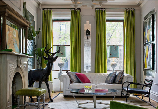
2. Stand Out With Chartreuse

This color is also perfect for dressing standout pieces of the house. Whether that be the sofa or office accent chair, chartreuse makes for a great option of creating focal points in any room. Like this sofa for example, it transforms this charcoal-dipped space into something even more stylish.
3. Chartreuse Bold Choice.
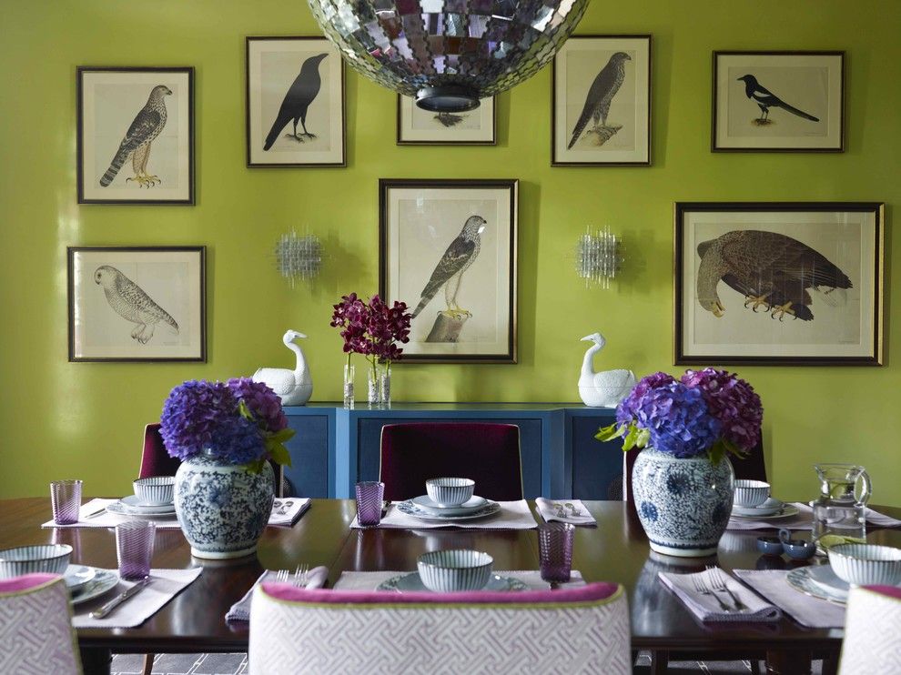
Don’t be scared of going bold. Your dining room could be the highlight of your home if you decide to dress the walls in chartreuse and make them pop even more by adding violet and cobalt blue around the space for complimenting and accessorizing.
4. Chartreuse Lightened Up.

Give your chartreuse walls a lighter look by placing them in an area with a lot of natural lighting and creamy textures and wooden accents. It gives a softer look to this lively, green shade and a more touchable finish. But it never takes away from its unique look!{found on pillmaharam}.
5. Chartreuse Retro Style.

This color dresses retro pieces really well. There’s something about the funkiness of the color that makes retro pieces look contemporary and hip. It’s a great way to mesh that vintage flair with fashion-forward energy without committing to a blander, more traditional look.{found on dijeaupoage}.
6. Chartreuse Printed Looks.

For a completely surprising and outside-the-box space, decorate it with a printed piece of chartreuse. This guest bathroom has texture, tone, depth and interest with just the addition of these patterned wallpaper. It may seem busy but we see it as a fun addition to the house.
7. Trendy Additions.

This blue-hued room was taken to an entirely different level with the addition of these trendy and fun chartreuse chairs. It adds a youthful presence to the space and makes a personal touch that much more evident. The pairing of these two shades really is quite magical.
8. Outdoor Ideas.

Chartreuse can even brighten up and add style to your outdoor areas. From the front porch to the back, paired with whites, blacks or charcoals, this color will make your outside pop with a bout of design-worthy envy. You’ll have the best curbside on the block!{found on fabarchitecture}.
9. Small Spots.

This chartreuse door makes this simple and sleek space so much more interesting and fun. This is a great example of how an easy addition and idea can transform even the smallest of spaces around the house – and anyone can make this happen without breaking the bank.{found on feldmanarchitecture}.
10. Funky Accents.

Chartreuse is really one of the best colors to dress your home in funky styles with. Because it has such a unique tone and texture all its own, it makes for such a fun way of decorating with prints and personality-filled nick-knacks and tidbits.{found on amylaudesign}.
11. Matching accents.

The bright chartreuse accents give this dining room a really vibrant and exciting look and create a sunny atmosphere without being too bold. Also, it’s beautiful how the chairs and the curtains fill the whole room with color. This gorgeous space was designed by Martha O’Hara Interiors.
12. Complementary details.

Chartreuse is a powerful and vibrant color which is best used in small doses. It’s also a nuance that goes really well with certain neutrals, grays in particular. This combination is beautifully exemplified in this beach-inspired bedroom created by studio Musso Design Group.
13. Subtle hints.

This living room designed by Giulietti / Schouten Architects makes use of chartreuse as an accent color in a very interesting way. The color accents are unexpected, in the form of an accent wall that’s small and almost completely hidden behind the furniture as well as a simple border around the painting hanging above the fireplace.
14. Casual focal points.

A white ceiling and gray walls with a white border at the top and the bottom create a minimalistic and neutral décor which is beautifully balanced out by the wooden floor. However, it’s the chartreuse-colored sofa that completely changes the ambiance in this bedroom, infusing it with energy and adding a sophisticated vibe to its design. This beautiful space is the work of studio Wake + Loom Design.
15. Strong contrasts.

Introducing two strong accent colors into a room is not easy and yet Melhem Construction Group managed to make it work here. These colors are concentrated around the staircase area which features a dark turquoise wall complemented by a chartreuse bench and balanced out by the dark wooden floor.
16. Inspired by nature.

A little bit of color can add more character to a small structure like a garden shed for example. This one by Atmoscaper Design has a simple wooden exterior and it’s decorated with all these chartreuse-colored bits like window planters and trellises and that creates a really nice feeling of immersion and a strong connection with nature.
17. Fresh kitchen vibes.

It’s easy to get carried away when designing or decorating a kitchen and wanting everything to match. When you get the color palette just right the whole room suddenly comes together and everything looks perfect. Check out this beautiful mixture of dark wood, bright chartreuse and black countertops. Isn’t it wonderful?
18. An accent wall with a twist.

One of the easiest ways to add color to a room is by giving it an accent wall. That strategy was used in this playroom designed by Durham Builders but it took a unique turn. You see, it’s not just the wall that has this vibrant and beautiful shade of chartreuse on it but a section of the ceiling, the door and the shelves on it too.
19. Patio ideas.

Chartreuse is a nuance that fits beautifully into the color scheme used for outdoor areas such as patios, decks and backyard seating areas. It’s a color inspired by nature that belongs in nature and there are many interesting and creative ways to integrate it into various types of designs. Here, for example, it was used to create a backdrop for the patio in the form of a minimalist fireplace surround.
20. Rooftop energy.

The cities are surprisingly lacking in color, with most of the buildings being made of concrete and has a neutral feel to them. That’s why it’s very exciting and satisfying to bring lots of color into our designs and decors, especially outdoors. This magnificent rooftop deck by Chicago Green Design Inc. is bursting with energy and we absolutely love that about it.
The post What Color is Chartreuse: 20 Ideas and Inspiration appeared first on Home Decorating Trends - Homedit.


0 Commentaires