In order to understand lavender as a color we must first make the distinction between purple and violet. These two shades are often used interchangeably, although they refer to different things. True, they are both obtained by mixing red and blue but in different proportions. Purple is closer to blue than it is to red while violet is closer to red than blue.
Lavender is More Than One Color
You might think that lavender is lavender, but as with many colors, there’s a huge range of shades. The undertones in the shade you choose can make a huge difference to the room and it’s important to keep that in mind, not just for the paint on the walls, but also for all your décor items. Most importantly, not all shades of lavender are girly or feminine.
- Purple Lavender
Lavender that is more of a light purple really makes the space pop. If it’s too vibrant for you, use it as an accent instead of a main color. Also, remember that the hues you pait it with will change the vibe of the space. - Lavender Pink
Many shades of lavender are cool and can feel a bit too cold, except for those that have pink undertones. Choose this tye of shade if you want to create a lavender room that feels warm. - Lavender Gray
Gray has been the hot color for years, and although it may be past its main heyday, the gray shades of lavender are still relevant and popular. These moody shades can almost always be treated as a neutral. - Lavender Blue
A little reminiscent of a light periwinkle color, shades of lavender that skew toward the blue end of the spectrum are definitely cool colors. In fact, they may resemble blue or gray more than what you typically associate with lavender color.
Lavender color symbolism
Every color has a unique symbolism, a set of characteristics that we associate it with, whether the connection is based on natural elements or on something man-made. For purple, the symbolism can be a bit abstract at times.
- Purple is often associated with royalty. This has a simple explanation that is historically based. Because purple is not a color that’s easy to find in nature or easy to produce, there was a time when only the most wealthy were able to afford it, hence the association with royalty. That’s not the case anymore but the symbolism remains.
- Purple conveys wisdom and mystery and we often associate it with witches, wizards and magic. It’s a nice color to use in a décor if you want it to have a theatrical and artistic vibe.
- Certain shades of purple like lavender can have a soothing effect. It’s the color of the actual lavender plant which is known to be calming and relaxing. It’s also the color of lilacs, a beautiful and delicate flower.
- We also associate purple and its variations with the mystery of the deep and the outer space. It’s a color that makes us think of distant galaxies and clusters of stars far away.
- There’s also something quite exotic about purple, lavender and other similar nuanced shades. That’s also due to the fact that these colors don’t occur in nature very often. They’re rare and thus exotic and can also feel very artificial. This is one of the reasons why purple is such a strong color, one which people usually either love or hate.
We also associate purple and various variations of it with the mystery of the deep and the outer space. It’s a color that makes us think of distant galaxies and cluster of stars from far away.
There’s also something quite exotic of purple, lavender and other similar nuance. That’s also due to the fact that these colors don’t occur in nature very often. They’re rare and thus exotic and can also feel very artificial. This is one of the reasons why purple is such a strong color, one which people usually either love or hate.
18 Lavender color decor ideas
Mix a range of lavender hues
Lavender is the shade obtained by mixing purple with white. That’s because it’s a rather bluish shade, like a sort of very diluted purple. However, there are many different tones of lavender on the color chart these days, some of which are reddish and some of which are bluish. But because lavender takes its name from a flower and that too features variations, all of these shades are acceptable and defined by a single term: lavender.
It’s a neutral for kids rooms
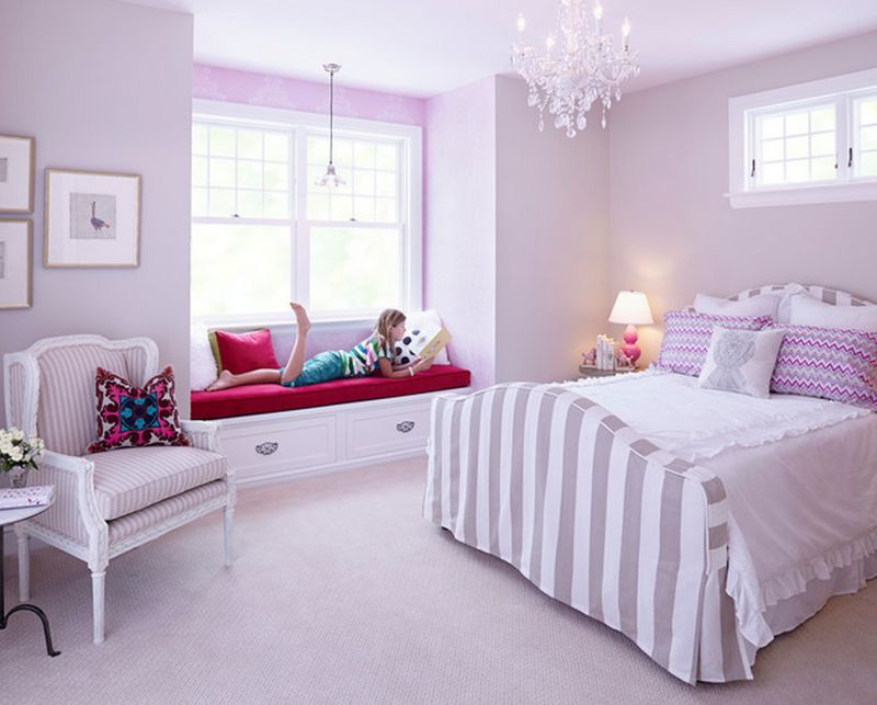
Lavender is often used in nurseries and kids’ rooms. It’s basically a neutral shade suitable for both girls and boys but we can take advantage of the numerous variations which can be obtained and bring it closer to pink or closer to blue in order to make a distinction.{found on hendelhomes}.
Warm Up a Pastel Lavender Palette
When combined with various pastels and with white, lavender is a relaxing and soothing color. But it’s also a rather cold shade so add some orange, yellow or red to the mix to warm up the room.
Add a Lavender Accent Wall
Most often, lavender is used on the walls. But having all the walls in a room painted lavender can be a bit too much. So an accent wall is preferred. And because lavender looks well when combined with white or light grey, this is a suitable option.
Make it A Muted, Sophisticated Shade
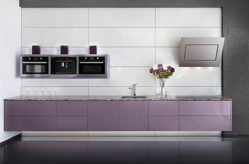
But as pure and innocent as lavender may seem as a color, it’s not only for the kids. In fact, it can look very sophisticated when used in other settings. For example, this kitchen seems to have it all figured out. Lavender is the accent color and the white and grey details make it stand out in an exquisite way.
Go for a More Vibrant Hue
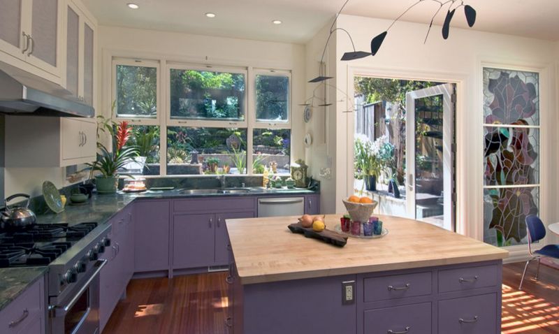
A richer lavender tone can be used when a more vibrant look is desired. Just like the faint pastel tones, it looks great when combined with grey and white but also with wood in order to get a balanced, warm and inviting ambiance.{found on jeffkingandco}.
Use Lavender for a Luxe Look
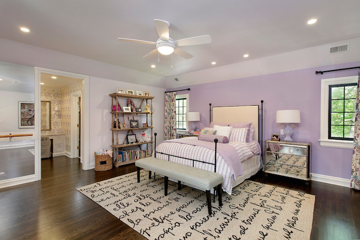
Just like purple, lavender is a color with royal and sophisticated flair. This becomes more visible when paired with the right textures and fabrics. This bedroom is a perfect example, featuring satin accents and mirrored surfaces.
Amp up the Feminine Side
In order to get a feminine look, lavender can have a reddish-pinkish hue and it can be paired with violet, magenta and other shades. Just keep in mind that the décor has to moderated in order to stay relaxing.{found on blink}.
Try a Monochrome Look
You can play with various types of lavender shades in a bedroom to obtain a simple look that’s not monotonous. Mix in diverse patterns and some accent tones as well for diversity.
Go for the Unexpected
Lavender is a rather pretentious color and that is why it’s not usually used in living rooms. It doesn’t go well with a lot of other colors. But you can take advantage of the color’s nature to create a unique and unexpected look with a lavender area rug or something similar.{found on flegelsconstruction}.
Make it the Accent Color
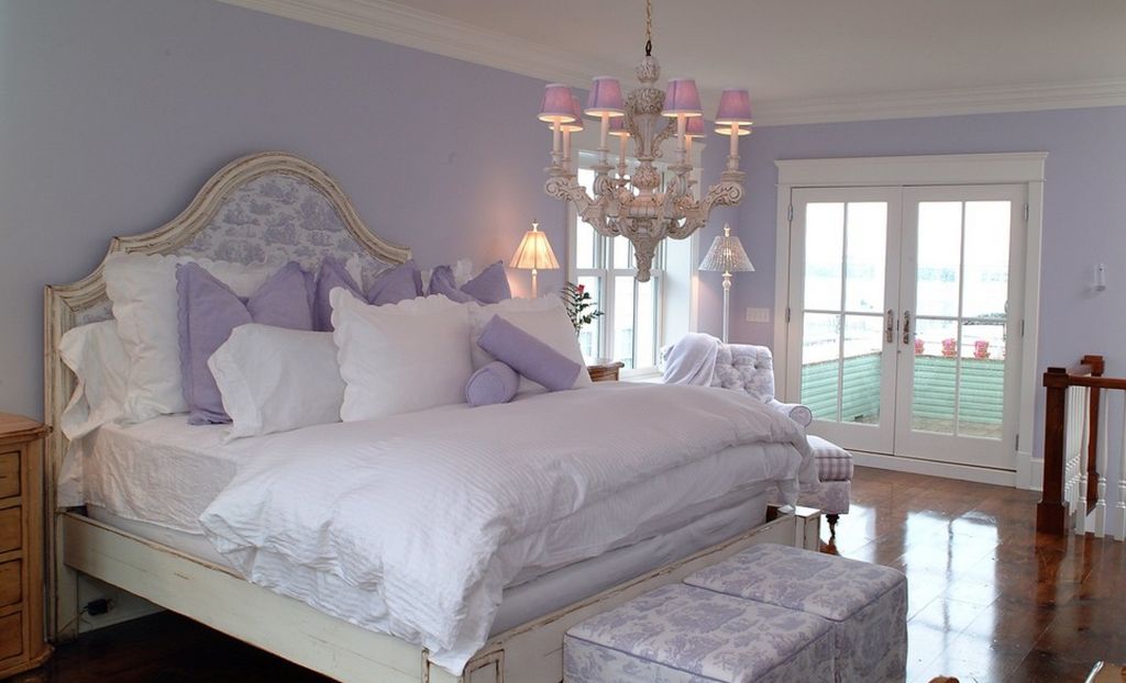
Lavender is a beautiful color to use in the bedroom. This is based on its relaxing and calming effect which we mentioned earlier. Add lavender accents in the form of accessories or little details that add up and stand out in contrast with the main color palette of the room.
Let Lavender Balance White
Here’s another beautiful example of how lavender and other purple-based nuances can be added to a bedroom. Here these colors give the room a feminine and sophisticated look. They’re definitely strong and vibrant but they also have a soothing feel.
Play Up the Exotic
These beautiful colors can also make the living room look magnificent. Because purple and any related nuances look so exotic even the more subdued hues stand out a lot. Take this lavender sofa for instance. The color is quite faint but still pops quite a bit.{found burnhamdesign}.
Tame it With Texture
Mix lavender and purple with various different textures and patterns to soften and tame them. Strong colors such as these can become overwhelming if introduced on large and flat surfaces. It’s nice to complement them with soft and rich textures.{found on susanglickinteriors}.
Better than Pink
Lavender is a beautiful color for a girl’s bedroom. It’s the more grown-up and sophisticated version of pink in this sense. Pair it with elegant and delicate textures and finishes, add pattern and play with different finishes to create a chic décor.{found on kbwinteriors}.
Go for a Bold Look
Darker and richer shades of purple and lavender can also look beautiful. They can look quite intense if not complemented by other nuances or used in combination with pleasing textures and finishes. This kids’ bedroom is a nice example of a bold but also well-balanced décor.{found on korayyavuzer}.
Take it Outside
Lavender is also a gorgeous color for the outdoor areas such as patios, terraces and so on. It’s not a color that commonly occurs in nature so you can be sure it will stand out and it won’t blend in with the surroundings.{found on mcdugaldsteele}.
Use A Natural Touch
Of course, purple does occasionally occur in nature and you can find lots of inspiration in plants such as lavender and various flowers in order to create a magnificent landscape. We love how deep and rich the colors of these planters spread across the terrace are. They go really well with the light and warm colors of the stones.
So You Want to Paint the Walls Lavender…
Not surprisingly, we’re huge fans of painting because there’s no faster or more budget-friendly way to transform a room. That said, many people start out with enthusiasm, but find it waning halfway through the project. The lack of excitement can easily translate into cutting corners and getting sloppy with the paint job, leaving you unhappy with the results.
If you’re going to do it, do it right. Here’s the right way to paint a wall – or all of them – along with some tips that will make the work go more smoothly. Follow these and you’ll not only be happy with your paint job, you’ll be proud of yourself too.
Start With a Clean Surface
This might seem quite basic, but be sure to clean the walls and let them dry before you start painting, especially if you have really dirty areas. You might be tempted just to paint over it all just to make it disappear, but that’s a bad idea. Dirt, grease or grime on the wall can prevent the paint from adhering properly, leading to chipping and peeling over time. You also want to fill any holes, dents or scratches and sand the wall smooth before you start painting.
Skip the Plastic and Use Cotton Drop Cloths
It’s virtually impossible to paint without spilling splashing or dripping so drop cloths are a must. Plastic drop cloths are slippery – even more so when paint is spilled on them, and you’re more likely to track paint off the cloth onto the carpet or floor. With any type of drop cloth, be sure to clean up any big spills right away.
Mix Multiple Cans of Paint in One Bucket
Depending on how large an area you are painting, you may have multiple cans of paint. While all are mixed using an automated formula, there can still be slight variations in the color from one can to another. If you’re like most people, you typically pop open a can, stir it up and pour it into a paint tray, but any color variations might be noticeable as you work your way around the room. Instead:
- Open the cans and mix them together in one big 5 gallon bucket. If your estimates of how much paint you need are between cans, round up. You can always pour it back into the can.
- For big paint job, always use the bucket and a screen for the roller instead of a tray. It’s just faster.
- If you’ve never used a screen before, all you do is dip the roller in the bucket of paint and then roll it on the screen until it’s not dripping any more.
Strategically Use Primer
If your freshly painted wall looks a little funky or blotchy , it could be because of the holes and scratches you repaired. Paint often soaks into the repair materials differently from the rest of the wall, creating an uneven sheen. To avoid this problem, a quick coat of primer on the repaired areas will solve the problem – just be sure to feather the edges of the area!
Trim First, Walls Second
Any professional painter will tell you to start with the trim and then do the walls. If you’re painting the ceiling too, make sure you do that before the walls. Why? It’s far simpler to tape off the trim than the walls. And, when you’re doing the trim, you don’t have to fuss over getting paint on the wall. Be sure to let trim paint dry 24 at least 24 hours before you put tape on it.
Sand Trim Between Coats
If your trim has any imperfections or too much shine, you need to sand the surface of the trim between coats of paint. One coat of paint is almost never enough. Adding this extra step to the process will give you a silky smooth finish.
- Let the first coat of paint on the trim dry at least 24 hours.
- Use a sanding sponge instead of sandpaper because it can get into curves and crevices better. Also be sure that it has a fine-grit surface.
- Vacuum the trim and wipe it down before doing the second coat.
Use a Small Roller Along the Edges
If you’ve ever done any painting, you may have noticed that the places you paint with a brush look different from those that you painted using a roller. That happens because the two methods create different paint texture
- The first way to avoid this is to paint with the brush and them immediately roll the area with the paint roller.
- The other method is to use a small, three-inch. Roller to paint as close as possible to windows, doors and trim. Next roll the rest of the wall.
Roll the Full Height of the Wall
- A methodical approach to applying paint with a roller is best and the ideal way is to roll up and. Down the full height of the wall. As you do this, keep a wet edge so that each stroke overlaps the one before. This process helps prevent lap marks — the stripes that occur when you roll over partially dry paint.
- When rolling, go back over any spots as necessary to clear up any drips areas where the paint seems too thick.
- Load paint onto the. roller often so that it does not dry out. Ideally, it will also be half full of paint.
- Hold the roller so that the open end faces the area you already painted. This is preferable because there’s more pressure on the frame end of the roller. Keeping the light pressure toward the painted section helps prevent ridges in the paint.
Feather Out Paint
- If you’re painting a larger space, it can be nearly impossible to keep a wet edge as you roll the wall. You can still prevent lap marks feathering out the paint along the edges that you can’t keep wet. You can do this by rolling the almost-dry roller in different directions along the dry edge. The go back and pick up rolling on the paint.
Second Coat Goes the Other Way
When it’s time for the second coat, roll the paint on in the opposite direction. This will make to colors look more even and avoid lap marks..
The post What Is Lavender And How To Work With This Color appeared first on Home Decorating Trends - Homedit.







0 Commentaires