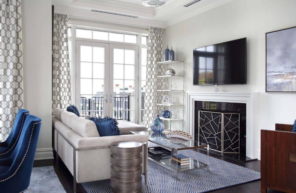
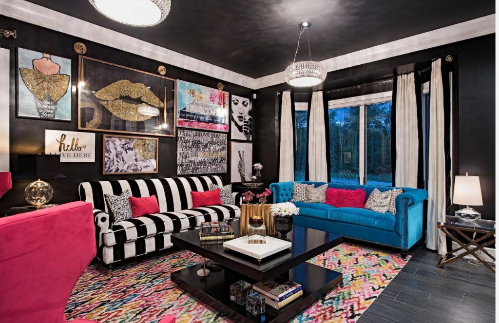
Blue is such a safe yet effective color to use. It goes with any other color! All you have to do is pick the right shade to match your secondary color. With hundreds of blue shades to choose from though, it can be overwhelming.
That’s why we’ve picked out some safe go-to colors, each having a blue complementary color that never fails. Check out these combos to find your perfect blue!
Coral And Ocean Blue

Coral is found in the ocean, so of course, a nautical blue is your best bet to match it. These two colors can go in any beach house or turn any room into a beach-themed room. If you choose the right decor, you can even take “beach” out of the equation.
The room will however be breezy and fun. So if that’s not you, then go with one of our other combinations.
Turquoise And Sandy Brown

Another beachy combination with more room for interpretation is turquoise and sandy brown. The sandy brown acts as a soft neutral color with calming tones, while the turquoise offers a bright breath of fresh air.
This is perfect for a teen room or even a living room. Tone down the turquoise for a softer look or brighten it up for something bold. The best part about this is that it can be American Indian-inspired as well.
Copper And Vintage Blue

Copper is a great metallic to use with most colors. If you choose the right tone you can really make it stand out too. Brighter tones will make the entire room look bold and daring. While softer tones will keep things chic.
When paired with vintage blue, things can go industrial or shabby chic. Even rustic. That’s what’s so special about this combo, it leaves you with so many options when it comes to design style.
Dreamy Blue And Lavender

If you use this combo, you’ll want some essential oils because this is a place for relaxation and therapy. Lavender is such an inviting springtime color that pairs wonderfully with a dreamy blue. Isn’t it marvelous?
You can play with shades on the blue, and a little with the lavender. Step things up by picking real lavender or buying it. You will be surprised at how wonderful real lavender smells on your countertop.
Midnight Blue And Burnt Orange

Orange is a tricky color to use. You have to make sure it’s just the right shade to pair with your other color. Midnight blue and rusty or burnt orange are sophisticated, classy, and warm. You will be shocked at how effective it can be.
If you want to step things up, then get orange decor with a bit of a shimmer. Make sure that this type of room has character, which is pretty easy considering the color combo itself has a lot of character.
Peach And Royal Blue

Peach is a fun color to play around with and experiment with. Pair it with royal blue for a surprisingly dynamic look. In truth though, peach can go well with any type of blue. It simply changes the look when you change the shade.
For a nautical look, make the blue have a green tint. For a regal look, make sure the blue is of a darker shade. Get some sample cards and try out your own combos next to your feature pieces.
Teal And Orange

Another orange that has a hard time finding a partner. Luckily, teal complements orange exceptionally well. You see, orange is one of the least, if not the least, popular colors when it comes to interior design.
So if you can pull it off, you can use it and have one of the most unique houses in the neighborhood. Use it on the exterior of your house for a huge statement or in the bedroom for something just for you.
Cherry Blossom And Maya Blue

Maya blue is a special color with ancient origins. It’s hard to find, so when you do find it in a shade that you love, then latch on. The same thing goes for cherry blossom pink. An ancient color with spiritual connections.
The two together can make any room comfortable, spiritual, and peaceful. We all need a little more serenity in our lives. If we need to choose certain colors to accomplish that, then so be it.
Sky Blue And Cloud White

This one is a given. Of course sky blue and cloud white go well together. They are a natural color combination that has been the inspiration for interior design, fashion, and more since the beginning of time.
There’s a reason why clouds are often painted on blue walls in nurseries and other bedrooms.
Pink Lady And Baby Blue

There’s something special about this combo. It’s perfect for any nursery or for two siblings who just can’t agree on a color. One is traditionally for baby boys while the other is for baby girls. Keep it gender-neutral with both colors.
Play with the exact shades a bit, keeping it pink and blue. This is a classic shabby chic or cottage combo, so it will feel cozy and comforting.
Denim Blue And Stark White

Levi’s and a white t-shirt. The golden combo, right? So why not apply that combo to interior design? The two go so well together that they can be put in any room and in any type of design style. It is a safe choice.
The denim is usually a but faded as the dyes in jeans usually fade after a short time. The white is usually bright as it is continually starched and bleached. This combo is a whole mood.
Cerulean and Pale Yellow

Cerulean can come in many different shades. It can be a blue-green ocean-like color. Or, it can be a soft, yet sure cottage-like blue. If you prefer the latter, then you will love it paired with a soft yellow.
If you want a brighter cerulean, consider pairing it with a sunshiny yellow instead of a pale yellow. Now if you only keep one color bold then one will outshine the other and you won’t maintain balance.
Silver And Periwinkle

Silver is a safe metallic to use because it really does go with anything. Especially cooler colors like periwinkle blue. Since periwinkle already has silver tones in it, they will be brought out with true silver.
Be careful with periwinkles because most of them will have purple tints, which can throw a room off if you’re not prepared. So make sure you know what color you are getting.
Gold And Navy

If you prefer gold over silver, then stick with darker blues like navy. Gold is a royal color that will overpower most soft colors, so you have to be careful with it. Navy is another strong color that can balance out gold.
Together, they are the most regal combination that doesn’t involve purple. Use it carefully because it is a combo to impress.
Hot Pink And Bright Blue

Again, if you have a bold color, you either have to fight back with another bold color or a neutral. Or perhaps, both. Black and white together can offset two bright colors just enough to even them out again.
When it comes to hot pink, it takes a color as strong as bright blue to match it. Together they can brighten up any room.
Faded Blue And Dusty Rose

Faded blue and dusty rose is an amazing combo with class, elegance, and calming nature. You can use it in any room in the house for an effective combo that is safe yet makes a big impact on those who enter.
Again, experiment to get the exact shades that you want and consider adding creams or whites. This is the most effective neutral for this combo.
Aquamarine And Brown

This combo was everything for teenagers in the early 2000s. Although the popularity has faded a bit, the combo is just as effective as it has always been. The neutral brown really compliments the character of the blue.
The best part about it is that you can go as bright or as soft as you want with the aquamarine. You can also go with tan or chocolate brown on the neutral side.
Barely Blue And Cream

Creamy white is a great color that offers warmth without making things heavy like darker warm colors do. Pair it with a soft color that is quite sparse for a calming atmosphere and a sophisticated room.
A barely-there blue is a great option that can work in small amounts or in a paint that has just a hint of blue in it.
Crayon Blue And Lime

Lime is a popular green color that can pair well with multiple different colors. However, a brighter childlike blue is a great option because the two together are light and playful. That’s what lime should be.
Lime is for people who want more fun out of life rather than to keep things heavy. It’s also summery and breezy, something we all need more of.
Silver Blue And Forest Green

For a darker green, more silvery blue works better. Forest green is a great green to pair with this kind of blue. Like a silver-blue lake surrounded by pine trees, this combo is inspired by the best parts of nature.
You can even go with just plain silver, but the point is to find complementary blue colors! This is one of the best that we’ve found!
The post Blue Complementary Color Combos That Never Fail appeared first on Home Decorating Trends - Homedit.
0 Commentaires